About the project
• Research | UX Design | UI Design
• Group Project
• Duration: 12 Weeks
• Tools: Figma, Illustrator, Photoshop, InDesign
• Website: https://www.grabo-app.ca
My role
My role as a Lead UI/UX Designer at this Project was to deliver clear and concise design within a 12 weeks deadline.
As the Lead, I was in charge of creating schedules, assigning tasks, and compiling documentation. To help the team collaborate more effectively, I listed and explained the topics we were going to cover before each meeting.
I also produced one of the personas as well as wireframes, mockups and the branding logo and choosing the UI kit (typography and colour pallet) with the collaboration of the design team.
I also produced one of the personas as well as wireframes, mockups and the branding logo and choosing the UI kit (typography and colour pallet) with the collaboration of the design team.
The Process
We have all had the experience of refraining from buying food products from overseas because it is written in unreadable characters or because we do not know if it is a popular product or not. As a result of this scenario, we will miss out on the possibility to try foods from various places for the first time.
Grabo connects users all over the world and lets them share food experience!
Users (Questioners) can take a picture of a foreign food product which they can’t understand and select specific language group(s). Group members will be immediately notified when a request is sent to the group, and they can answer about the products.
User Persona
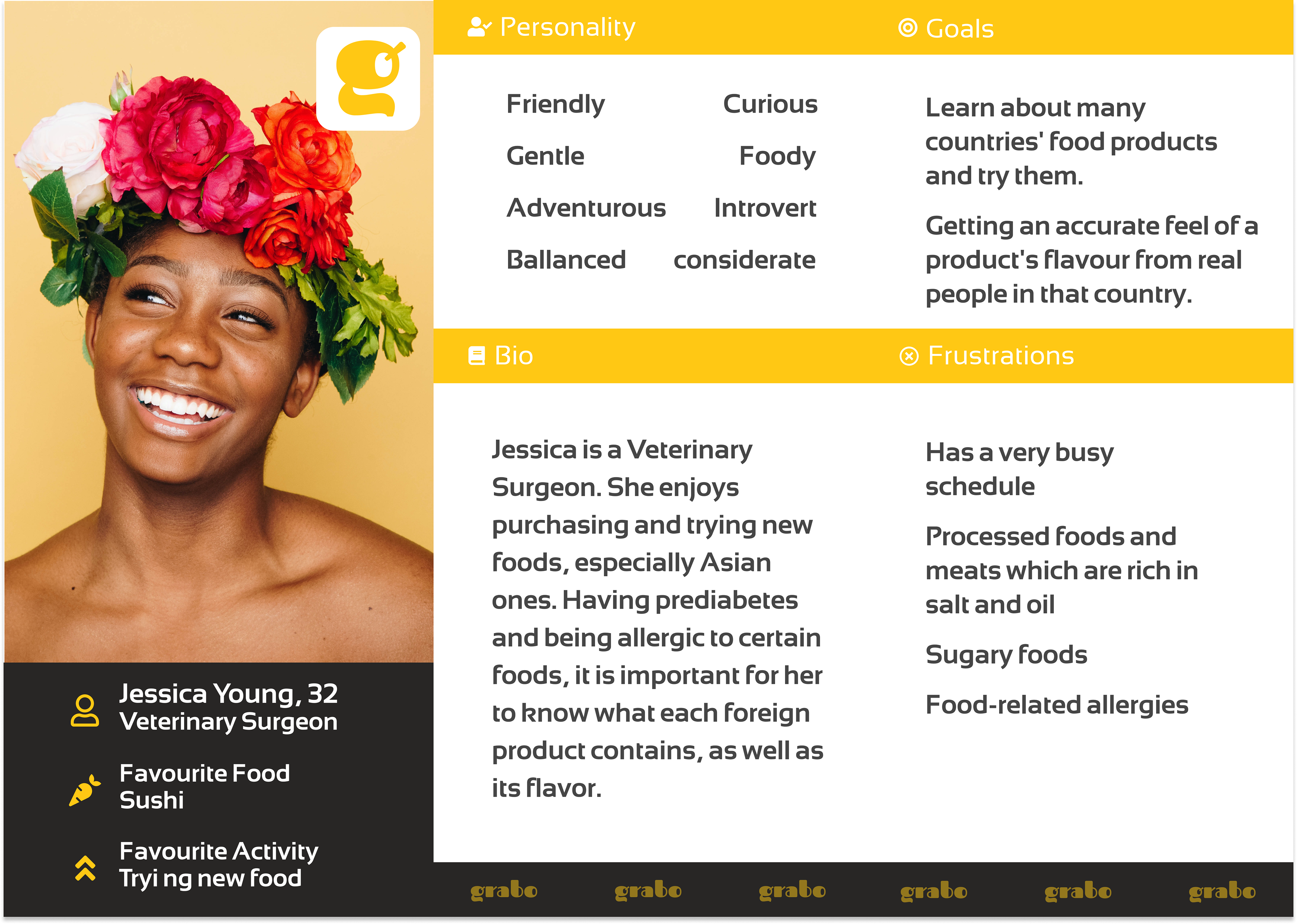
User Persona1
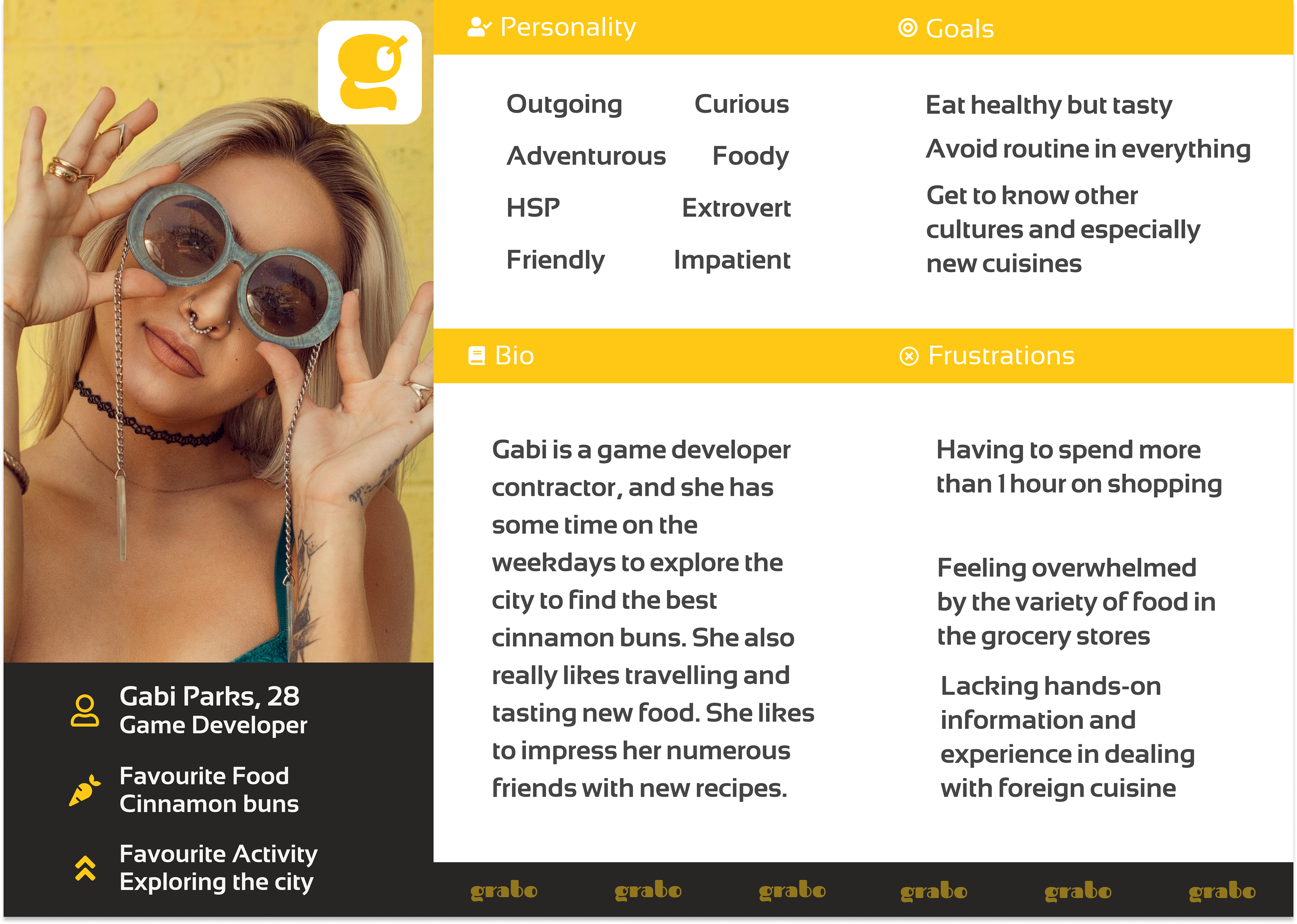
User Persona2
User Flow
Main Features
Design Technology
Wireframes
Branding
Color Pallete
I chose a monotone color palette for its versatility, since it creates a harmonious and aesthetically coherent design while also allowing our content to stand out.
The darker colour was utilised for the text, while the yellowish one was used for the buttons and active navigation, the grey was used for the backgrounds and inactive navs and the white color was used for our cards.
Logo
The logo is a wordmark logo with a clean and straightforward graphic. This logo also has a fresh approach with mouth illustration to give the sense that our app is related to food.
Typography
I used the "Roboto" font because it is legible and reads well on multiple devices. “Fascinate” typeface was used for the logo.
Icons
The icon collection was created with the goal of conveying the message in a simple and consistent manner. Icons were used in the top and bottom navigation, as well as in various portions of the app.
Buttons
The buttons on the app are consistent. The primary buttons are used for the main call to action. All of the primary buttons on the app will have a solid background colour. The secondary buttons, which are part of a pair, have a white background and a stroke that matches the colour of the primary buttons. FAB are floating action buttons.
Mockup Screens
Grabo! USP
Project
Proposal
Creating and conducting the proposal was one of my responsibilities in this project. I used Adobe InDesign to create the best outcome possible. I also used Adobe Photoshop for editing images and Adobe illustrator for creating illustrations used in this project.
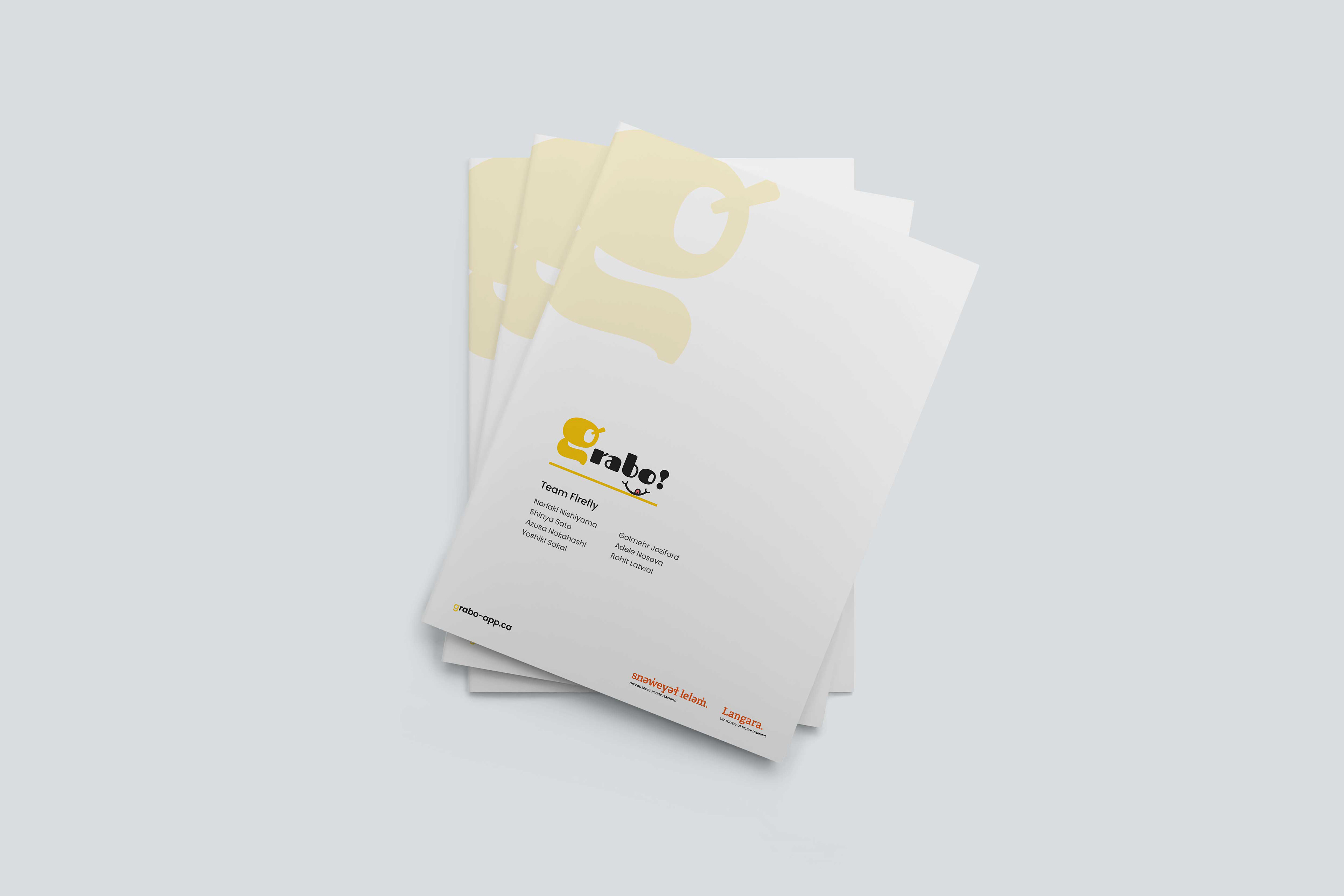
Grabo Proposal Cover
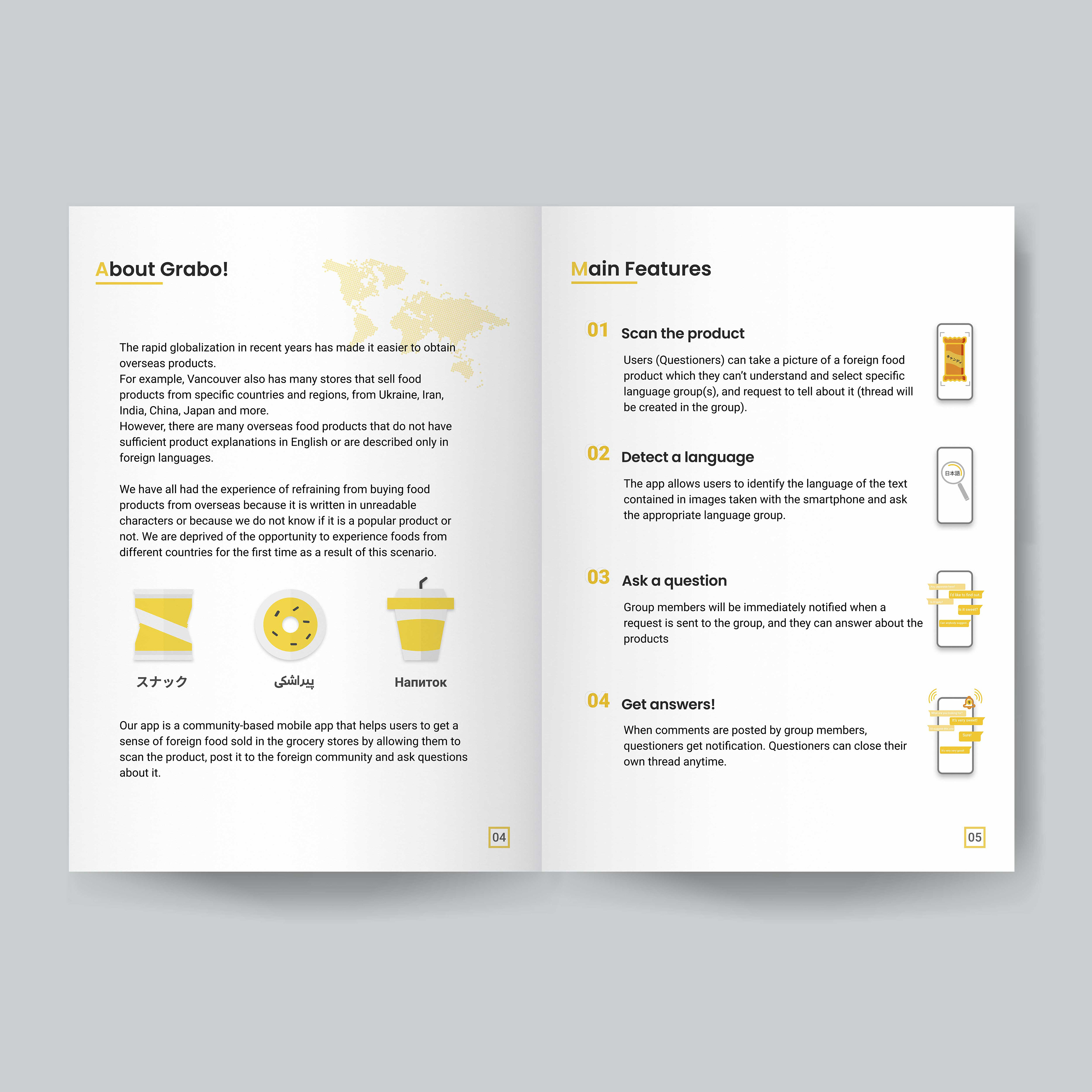
Grabo Proposal Section divider1
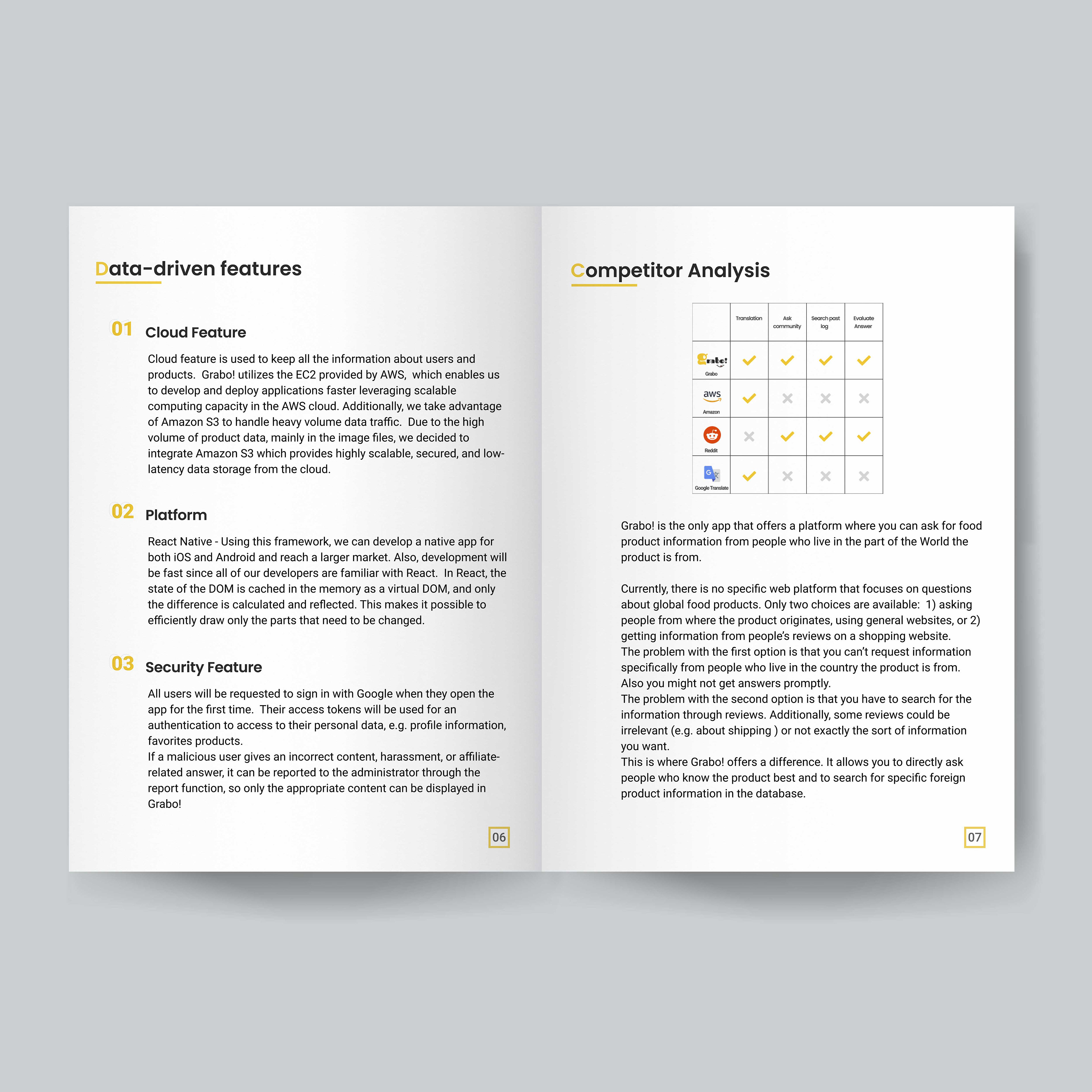
Grabo Proposal Section divider2
Marketing Assets
Promotional Video
What did I learn?
• I was able to apply user experience design thinking and marketing methods to create an app that is useful to users and will also provide the client with a marketing tool.
• As a team member, I learned how constant communication with the team and the client plays an important role specially when the project is in its early stage and even content is not available to use.
• As an UX/UI designer, I learned from user testing that how simplicity and intuitiveness are important in a content-heavy mobile app, especially for our users who consider time as a very valuable resource. They needed as less distraction as possible while they were using the app to be able to focus on the data they were getting.
